

























Jul 10
.
2 Min Read
Colour psychology drives every buying decision. Discover what your brand colour says and how to fix it. By Cloutgency, Chennai's branding agency.
Here's a statistic that should change how you think about your brand forever.
Consumers form a first impression of your business within 90 seconds and up to 90% of that judgment is based on colour alone.
Not your product. Not your price. Not your five-star reviews.
Your colour.
Think about the last time you scrolled past a brand on Instagram and felt something before you even stopped to read the caption. That feeling of trust, hunger, calm, excitement was colour psychology doing its job silently. The most powerful brands in the world don't leave this to chance. They engineer it deliberately. And the brands that ignore it? They're losing sales without ever knowing why.
"Colour is not decoration. It's the first conversation your brand has with every single customer and most businesses are saying the wrong thing."
The numbers don't lie
This isn't guesswork. This is neuroscience, behavioural economics, and decades of brand research compressed into one uncomfortable truth: your brand colour is either working for you or against you. There is no neutral.
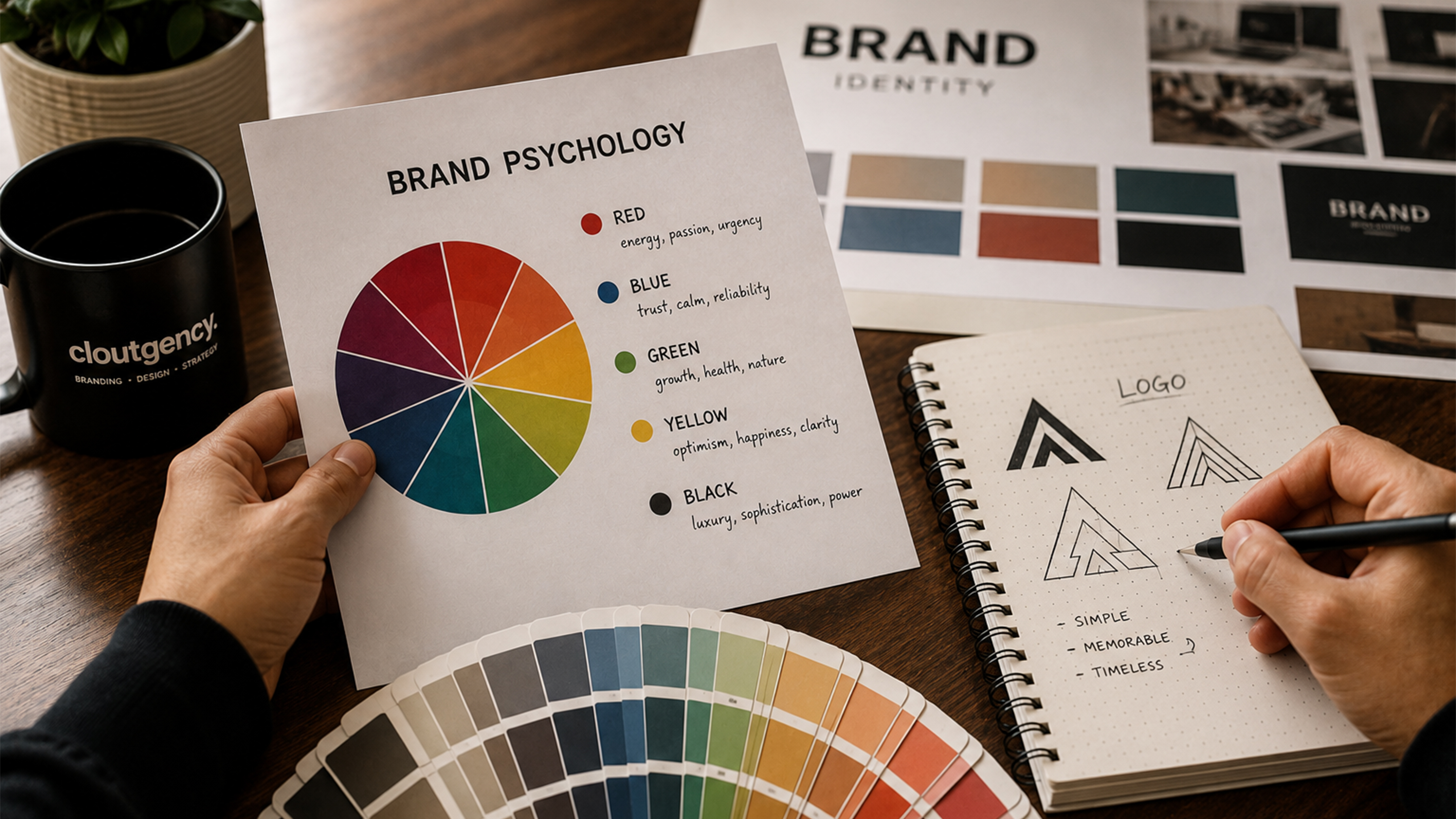
Colour psychology in branding is the strategic use of colour to trigger specific emotions, perceptions, and behaviours in consumers. It's based on the scientific understanding that different colours activate different emotional and psychological responses in the human brain and brands use this to build trust, communicate values, and drive purchasing decisions before a single word is read.
Whether you're a startup or an established Branding Company in Chennai looking to refresh your visual identity, understanding colour psychology is the single most high-leverage starting point for getting your brand right.
Every colour carries a psychological weight, a set of emotions and associations that humans have developed across centuries of cultural conditioning and evolutionary biology. Red signals danger or appetite. Blue communicates safety or authority. Green evokes nature or growth.
When a brand chooses its colour palette, it's not making an aesthetic decision. It's making a psychological contract with every person who sees it. That contract shapes whether a customer trusts you enough to buy, remembers you long enough to return, and recognizes you fast enough to choose you over a competitor in a split second.
The brands that understand this don't pick colours they like. They pick colours that make their customers feel exactly what they need to feel to take action.
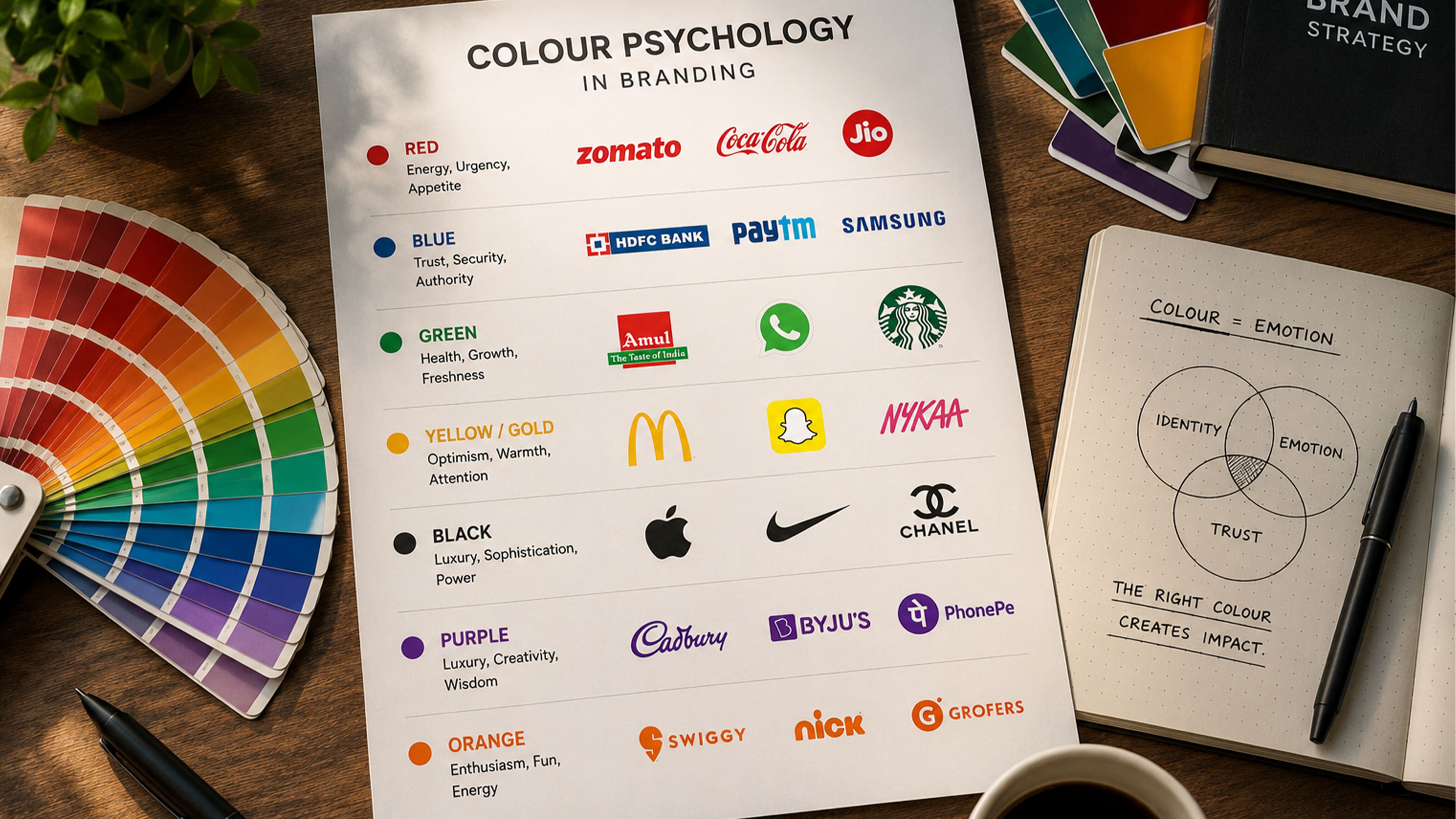
Here's the framework that every Creative Agency in Chennai including us at Cloutgency uses when building a brand identity from scratch. Understanding what each colour communicates is the non-negotiable starting point.
What it triggers: Excitement, hunger, passion, danger, speed Brands using it: Zomato, Swiggy, Coca-Cola, Jio, YouTube Best for: Food & beverage, entertainment, e-commerce, sales and promotions Chennai brand note: Red dominates Chennai's F&B and restaurant space if you're in this category and not using red or orange, you're fighting human psychology instead of using it.
What it triggers: Reliability, calm, professionalism, safety, intelligence Brands using it: HDFC, PayTM, LinkedIn, Ola, Samsung Best for: Finance, healthcare, technology, legal, corporate services Chennai brand note: Nearly every bank and hospital defaults to blue which means trust, but also sameness. If your healthcare or finance brand wants to stand out, consider a differentiated shade or a bold accent.
What it triggers: Nature, wellness, sustainability, prosperity, calm Brands using it: Amul, Naturals, Britannia, WhatsApp, Starbucks Best for: Healthcare, wellness, organic food, sustainability brands, finance Chennai brand note: Green resonates deeply with health-conscious Chennai audiences. Naturals salon uses it masterfully; it signals care and nature before you walk through the door.
What it triggers: Happiness, energy, friendliness, appetite, creativity Brands using it: McDonald's, Snapchat, IKEA, Nykaa, Auto-Rickshaw culture Best for: Youth brands, food, retail, creative agencies, affordable segments Chennai brand note: Yellow is the most attention-grabbing colour in outdoor advertising and Chennai's streets prove it. If you want to be noticed on a hoarding or a feed, yellow demands the eye first.
What it triggers: Premium quality, exclusivity, elegance, mystery, authority Brands using it: Apple, Chanel, Royal Enfield, Johnnie Walker, Nike Best for: Luxury goods, premium services, fashion, high-end real estate Chennai brand note: Black signals premium in any market but in Chennai's real estate space, navy-black combinations are dramatically underused. Most developers play it safe with blue-white. Black-and-gold is an open territory waiting to be owned.
What it triggers: Royalty, wisdom, imagination, spirituality, luxury Brands using it: Cadbury, Hallmark, FedEx, Ayurvedic brands Best for: Beauty, wellness, spiritual brands, confectionery, premium gifting Chennai brand note: Purple has historically been underused in Tamil Nadu's brand landscape which makes it a significant differentiation opportunity for the right brand category.
"The colour you choose doesn't just decorate your brand it determines whether your customer's brain files you under 'trust this' or 'scroll past this'."
The critical nuance most brands miss: Colour never works in isolation. Red on a food delivery app signals hunger and speed. Red on a hospital website signals danger and distress. Same colour, completely opposite effects. Because context, industry, typography, and execution change everything. This is why choosing your brand colour is not a one-hour Canva session. It requires understanding your audience's psychology, your competitors' landscape, and the exact emotion you need to trigger at every single touchpoint.
How does colour affect consumer buying decisions?
Colour influences buying decisions by triggering emotional responses that align or conflict with a customer's expectations of a brand. When a brand's colour signals the right emotion, trust for a bank, appetite for a restaurant, energy for a sports brand, customers are neurologically primed to engage and purchase. When the colour is wrong, they feel subtle dissonance and move on, often without consciously knowing why.
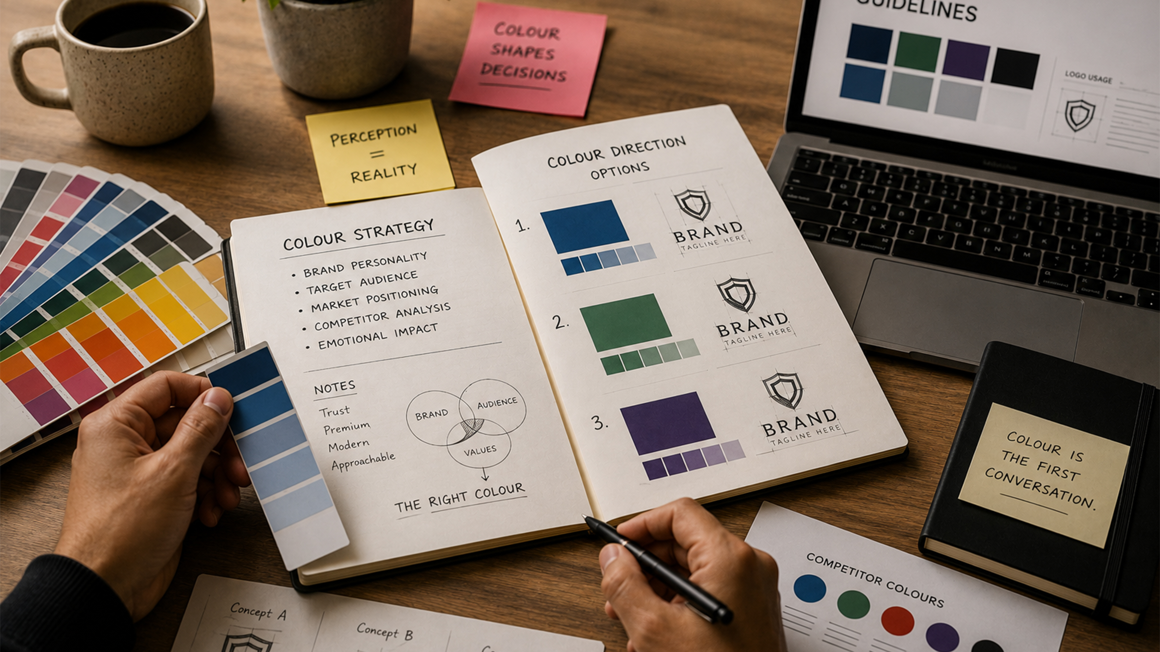
The most recognised brands in India haven't chosen their colours randomly. Every palette is a deliberate psychological engineering decision. Here's how five of India's most powerful brand colours work and the exact lesson your brand can take from each one.
Working with a creative agency in Chennai that genuinely understands this market gives you advantages that a generic agency or a remote team simply cannot replicate:
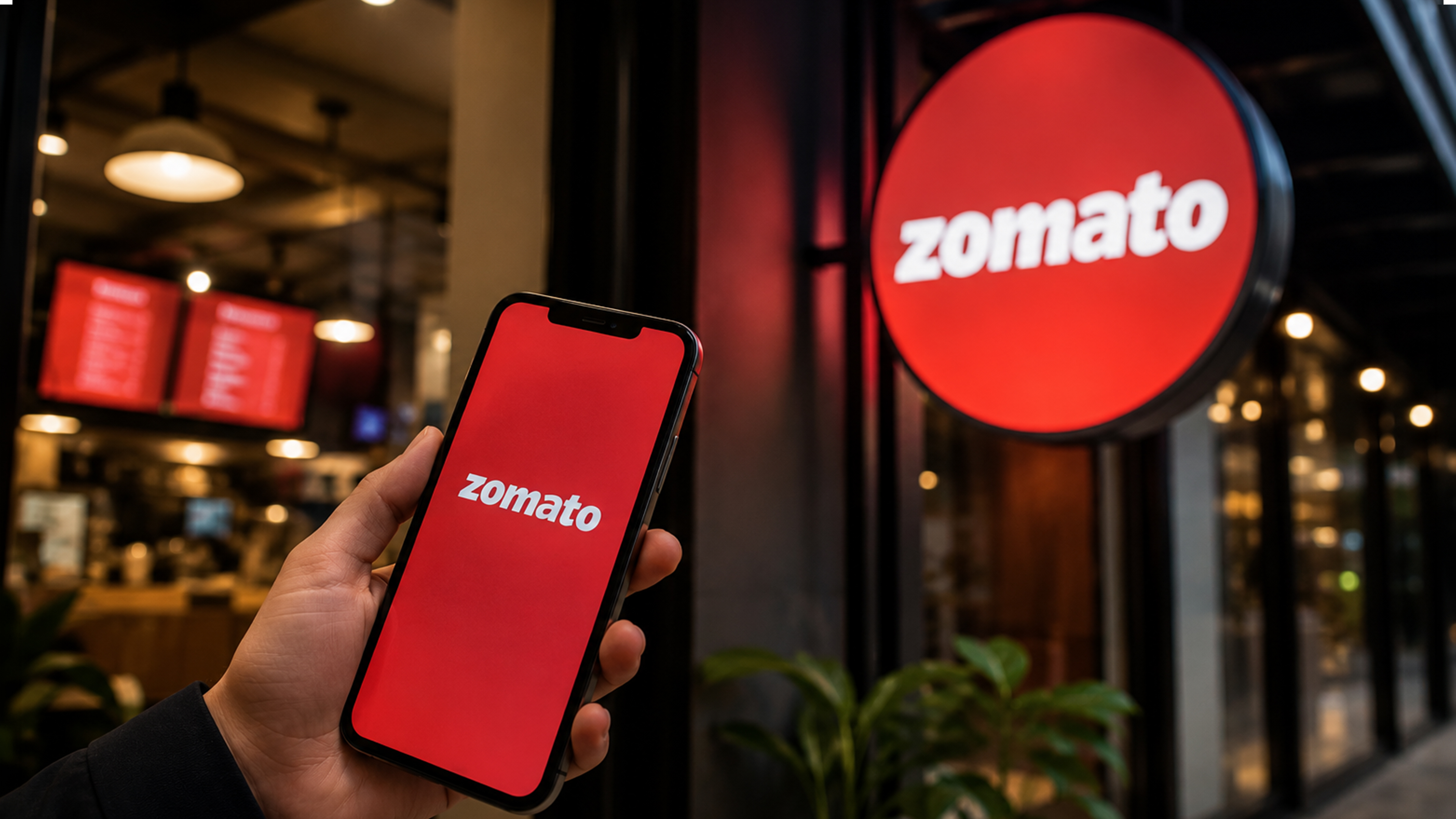
Zomato's red color is not an accident. Red increases heart rate slightly and triggers hunger hormones. It literally makes you feel like eating sooner. Zomato uses it to create urgency. Every shade of red in their app UI is a tiny psychological push toward "order now." The moment you open Zomato, your body is already primed to be hungry. That's not design. That's neuroscience in a product.
Banks cannot afford distrust not even for a second. Navy blue signals stability, authority, and reliability at a level so deep it bypasses conscious thought. When you see HDFC's deep blue, your nervous system registers "safe" before your brain reads a single word. In a category where trust is the product, colour is the most powerful trust signal available.
Amul's palette is engineered for mass market emotional warmth. Yellow signals happiness, approachability, and affordability. Combined with red for appetite, it creates a feeling of "familiar, wholesome, mine." Amul is not aspirational, it's relatable. Their colour tells that story to a billion people across every language and literacy level in India.
Hot pink is bold, feminine, and unapologetically celebratory. It signals beauty, confidence, and self-expression. The black grounds it in luxury and sophistication. Together they say: premium beauty that celebrates exactly who you are. This two-colour combination captures Nykaa's entire brand promise without a single word of copy. That's the power of colour psychology done right.
Paper Boat chose the opposite of the bold FMCG playbook. Their muted, nostalgic palette dusty pinks, faded oranges, washed-out yellows triggers childhood memory and emotional warmth. In a category dominated by bright primary colours, their restraint is the differentiation. They look like no one else on the shelf, which is the entire point.
Notice the pattern across all five: Every great Indian brand has a colour that tells a story before the brand speaks. The colour is not a finishing touch added at the end. It is the first chapter of everything.
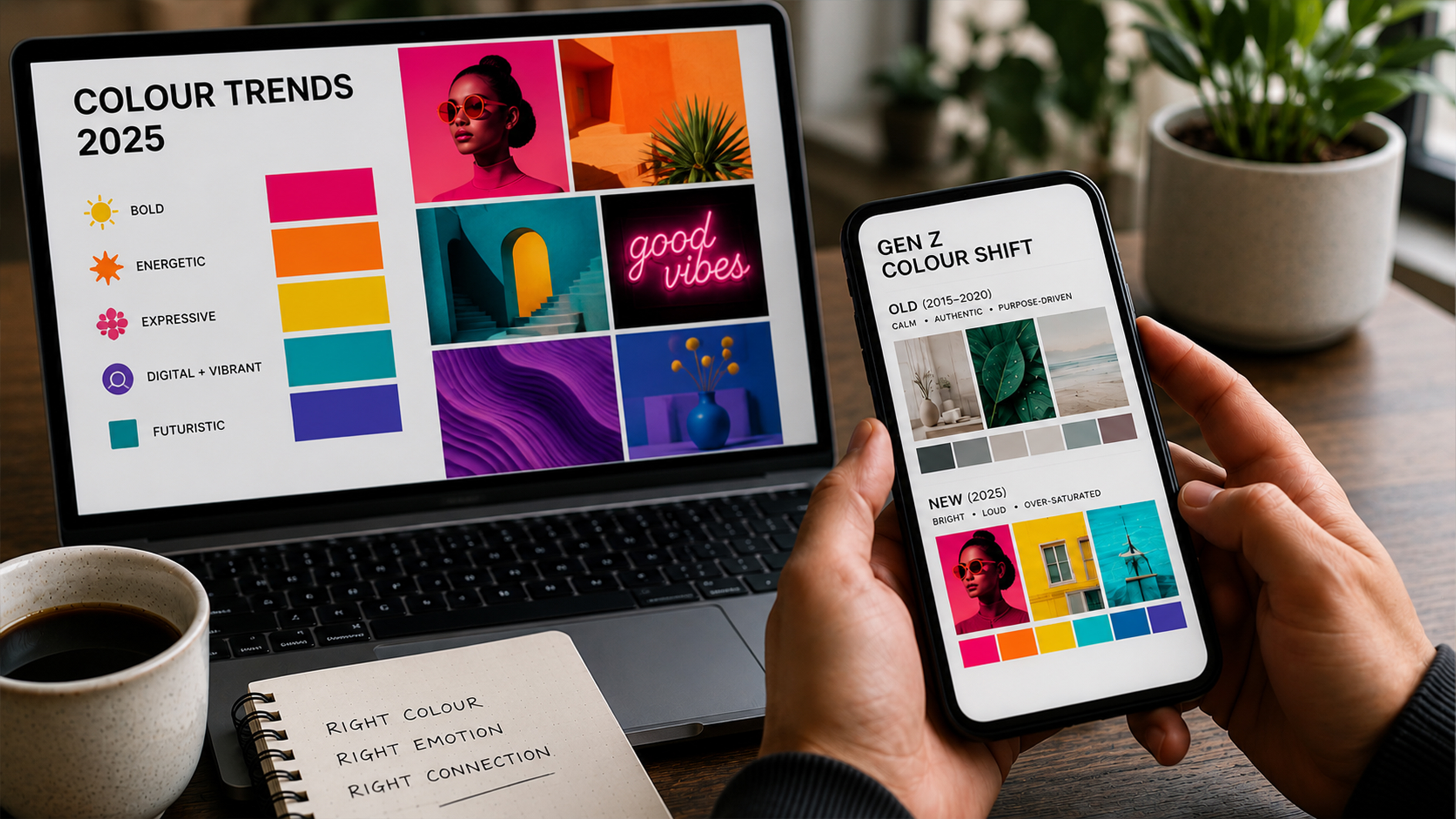
For the past decade, minimalism dominated brand design. Clean whites. Muted greys. Monochrome palettes. Every startup looked like it was designed by the same committee in a white-walled co-working space.
Then Gen Z happened and the rules changed completely.
"In 2026, the brands winning Gen Z's attention aren't the whitest, they're the boldest. Dopamine colours are the new trust signal for an entire generation that grew up on Instagram."
Dopamine colours : electric yellow, hot pink, neon green, saturated cobalt have exploded across the design landscape because they genuinely trigger pleasure responses in the brain. When your colour makes someone feel good just by looking at it, you've already won half the battle before a single word is read.This shift is especially significant for Chennai brands targeting younger consumers.
Brands that clung to safe, corporate colour palettes are watching Gen Z audiences scroll straight past them. Brands that embraced bold, unexpected palettes are seeing dramatically higher engagement, stronger brand recall, and significantly more organic sharing.
If your audience is 18–35: Explore bolder, more saturated palettes. Safe is invisible in this demographic. Your competitors' conservatism is your opportunity.If your audience is 35–55: Depth and sophistication still win here. Rich jewel tones, navy and gold, deep green bold without chaotic.If your audience is 55+: Trust signals dominate. Blues, greens, and warm neutrals. Established colour psychology rules apply most strongly here.The critical warning: Dopamine colour fatigue is already beginning. When every brand goes maximalist, none of them stand out. The next wave is bold with intention one dominant colour, owned completely, used with absolute consistency, rather than a rainbow explosion that signals noise instead of character.
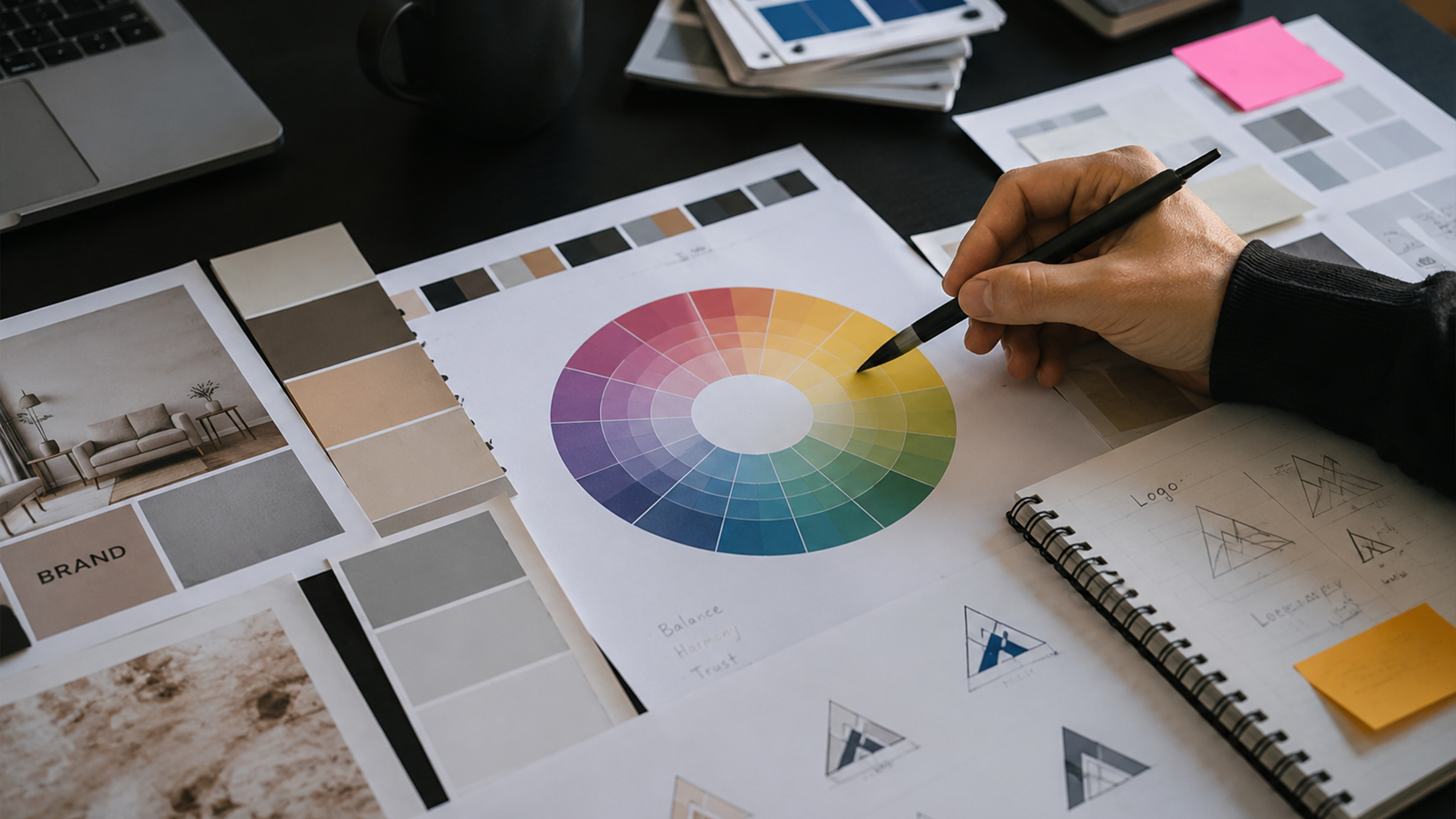
Choose your brand colour in 4 steps: (1) Define the ONE emotion you want customers to feel when they see your brand. (2) Research what colours your direct competitors use then differentiate deliberately. (3) Match the colour to your specific audience's cultural context, especially in India where colour meanings vary significantly by region and community. (4) Test your chosen colour across every touchpoint logo, packaging, website, social media for consistency before committing fully.
Most brands choose their colour because the founder liked it. Or because it looked good on a logo draft. Or worse because it was the default palette on a free Canva template.
This is how you end up with a brand identity that means nothing to your customer and disappears invisibly into a crowded market.Here is the four-step framework a professional brand identity design agency uses:
Before you look at a single colour swatch, answer this question completely: What is the ONE feeling you want customers to have the moment they encounter your brand? Trusted? Excited? Reassured? Energised? Premium? Playful? Everything else in your brand identity flows from this single answer. If you can't answer this clearly, no colour in the world will save your branding.
ap out the colour palettes of your top five competitors. Write them down. Look at them together. Now find the gap in the emotional territory nobody is owning. If every real estate developer in Chennai uses navy blue and white (they do), then the bold brand that chooses warm terracotta and cream will stand out immediately and own that visual territory completely.
This is exactly the kind of strategic colour differentiation that the best digital marketing company in Chennai will run for you before a single design asset is created mapping the market, finding the gap, and owning it.
The differentiation trap: Being different purely for difference's sake is as dangerous as blending in. Your differentiated colour must still trigger the psychologically appropriate response for your industry. A neon green bank feels wrong no matter how differentiated it is. Differentiation needs to be both unexpected and emotionally correct.
Colour meanings are not universal. In India, white is associated with mourning across many communities. Using it as a primary brand colour for a wedding or celebration brand is a subconscious mismatch that repels the very customers you're trying to attract. Green carries strong religious associations across multiple Indian communities. Saffron carries deep political and religious weight. Red at Diwali signals prosperity and celebration not danger.A Chennai branding agency that understands these cultural layers will save you from expensive mistakes that no amount of marketing budget can fix retrospectively.
Your colour must work on a mobile screen at 6am, on packaging under supermarket fluorescent lights, on an outdoor hoarding at noon sun in Chennai, and on a laptop monitor at night. Colours shift dramatically across different screens, printing methods, materials, and lighting conditions. Always demand physical print proofs alongside digital mockups before committing. The colour that looked perfect on your MacBook can look completely different printed on a packaging box. Cloutgency's approach for Chennai brands: At Cloutgency, before we sketch a single logo or design a single social media template, we run a full colour psychology audit for every client analysing their audience demographics, their competitors' palettes, and the precise emotional journey their customer needs to travel to trust and buy.
We've done this for real estate brands, restaurants, healthcare practices, and e-commerce brands across Chennai. The result is always the same: a brand that feels instantly, inexplicably right to its audience. That feeling is not magic, it's strategy.
See our branding services →
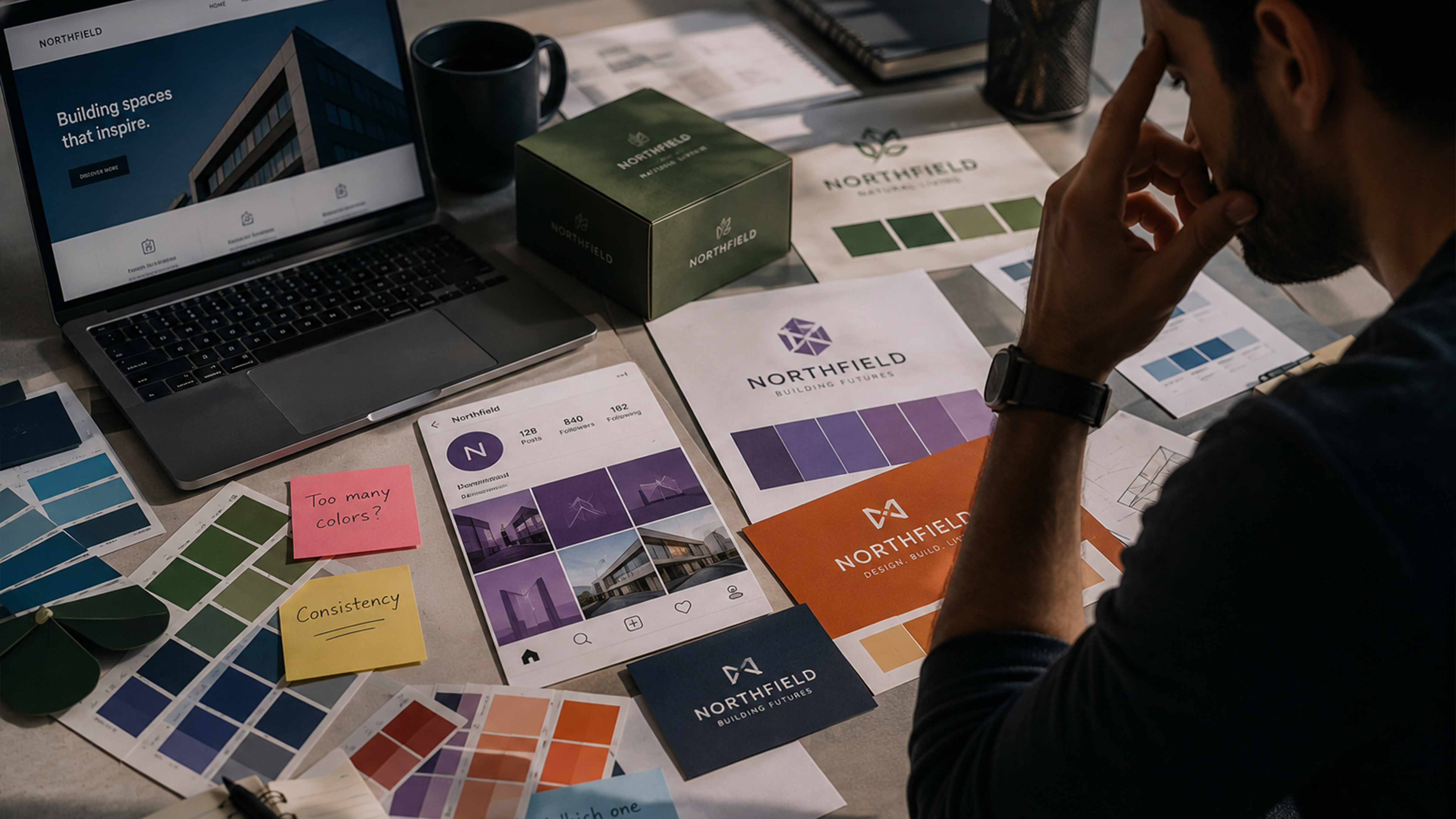
These are the most common branding errors we see when businesses come to Cloutgency asking why their marketing isn't converting despite significant spend. In almost every case, colour is part of the underlying problem.
Mistake 1 : Using too many colours More than three primary colours creates visual noise that registers as chaos in the viewer's brain. Your brand starts feeling scattered and untrustworthy without the customer knowing exactly why. The rule is simple: one primary colour, one secondary, one accent. Then stop completely. Discipline in colour use is a signal of brand confidence.
Mistake 2 : Ignoring colour consistency across touchpoints Your Instagram feed is purple. Your packaging is blue. Your website header is green. Your business card is navy. To any customer who encounters your brand across more than one channel, these look like three separate companies. Colour inconsistency is one of the fastest ways to destroy brand recognition you've spent money building.
Mistake 3 : Copying the market leader's palette If you look visually identical to the established leader in your category, customers will always choose the original. You've signalled that you're a follower, not a leader. Deliberate colour differentiation is one of the fastest and most cost-effective ways to carve your own space in a crowded market even before your product or service proves itself.
Mistake 4 : Choosing colour based on personal preference "I like green" is not a brand strategy. "My customers feel calm and healthy when they see green, which is the exact emotion needed before they commit to a high-ticket wellness service" that is a brand strategy. Your colour needs to resonate with your customer's psychology and your business objectives. Your personal taste is largely irrelevant.
Mistake 5 : Never updating a colour that no longer fits Brands evolve. Markets shift. If your business has moved from budget to premium, from traditional to modern, or from local to regional : your original colour palette may be sending completely the wrong psychological signal to the very customers you now want to attract. A colour audit every two to three years is not vanity. It's brand maintenance.
Most businesses spend months deliberating their pricing strategy, their hire decisions, and their product roadmap and then choose their brand colour in an afternoon because "it looked good."
That afternoon decision is shaping 90% of the first impression every single customer will ever have of your business.
Colour psychology in branding is not a creative indulgence. It is a revenue lever, one of the most direct connections between how you present your brand and how much money that brand makes. The brands that understand this are engineering trust, desire, and recognition into every pixel and every printed surface. The brands that don't are hoping for the best. If your brand falls in the second group, it's time to change that and start with a digital marketing service in Chennai that treats colour as the strategic business decision it truly is.
At Cloutgency, we build brand identities for Chennai businesses that are rooted in psychology and built to convert. If your current colour isn't working as hard as your team is it's time for a conversation.→ Get a Free Brand Colour Audit from Cloutgency → See How We've Built Brands for Chennai Businesses
For Indian markets: red and orange work best for food and FMCG brands as they signal energy and appetite. Blue builds trust most effectively for finance, insurance, and healthcare. Green signals freshness, health, and growth. Black and gold communicate luxury and aspiration. However, the single best colour for your brand depends entirely on your specific industry, target audience demographic, and competitive landscape in your particular city or region.
Zomato uses red because it psychologically triggers hunger, urgency, and excitement precisely the emotional states needed to drive impulsive food ordering behaviour. Red also increases heart rate slightly, creating a subconscious sense of appetite and time pressure. It is one of the most precisely calibrated and effective applications of colour psychology in Indian consumer branding.
Yes, but only when the new colour is strategically chosen based on audience psychology, not changed randomly for the sake of freshness. Brands that shift colour intentionally to better align with customer psychology and evolved positioning often see measurable improvements in recognition speed, perceived quality, and conversion rates. However, colour changes also carry real risk: long-established brands can lose hard-won recognition if they change too dramatically without a clear strategic narrative and communication plan.
For Chennai real estate brands targeting premium buyers, navy blue or deep teal communicates trust, stability, and quality the core emotions required in a high-value, high-trust purchase decision. Gold or warm cream accents signal aspiration and prestige. For affordable housing brands targeting first-time buyers, warmer palettes incorporating green elements signal growth, opportunity, and a welcoming entry point rather than corporate distance.
Signs your brand colour may be working against you include: customers consistently misreading your brand's positioning (thinking you're budget when you're premium, or corporate when you're creative), low brand recall in customer surveys, visual inconsistency across touchpoints, colour choices that mirror your direct competitors too closely, or a colour that made sense for your original audience but no longer fits who you're actually trying to attract.

.svg)

© Cloutgency 2024, All Rights Reserved